Introduction to Ontario.ca
The Government of Ontario website provides information to residents, businesses and visitors to Ontario. The site features information on Ontario government services and programs. One of the services provided on the website during the pandemic was the Covid-19 vaccination service.
Project overview
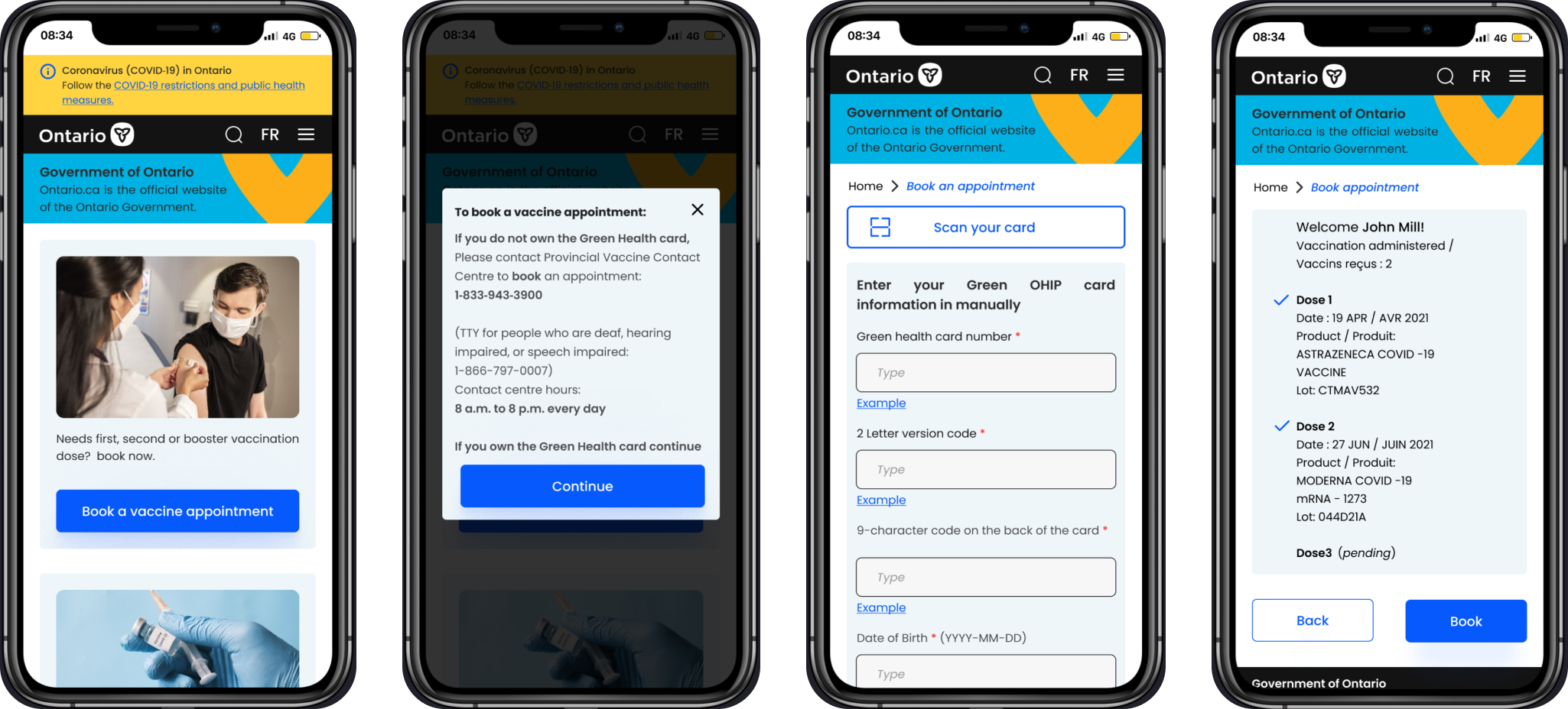
My team redesigned the Ontario vaccine website in order to make the booking process quicker and clearer for users with and without the Green OHIP card.
Methods
Primary Research
Secondary Research
Usability test
Sketching
Wireframe
Prototype
Year
June - August
2022
Timeline
10 weeks
Main Tools
Miro
Marvel App
Figma
Teams
My role
I worked as a UX designer on this project delivering an end-to-end experience. I conducted interviews, usability tests and also created part of the wireframes and prototype.
Problem
On the current Ontario website, users with or without a Green OHIP card have to go through the same steps and answer unnecessary questions to find out if they are eligible to book the next dose.
In addition, checking the available slots is time-consuming. So for those who are in need to get the vaccine ASAP, the process is frustrating.
Design process
The project is done through three design phases.
Since the Ontario booking website changed a few times during the pandemic, we did secondary research to find out what the steps are to book an appointment on the current website.
We discovered the challenges people faced and their unmet expectations while booking vaccine appointments by interviewing them. Based on our findings, we realized people's needs and the missing features from the website. Then, we created the wireframes, using pen and paper, and tested the paper prototype on Marvel App to validate the steps of the new user flow. Afterward, we refined the design, made the high-fidelity prototype on Figma, and made a short demo.
Users pain points
The main challenges users confronted when experienced booking vaccine appointments:
Too much information and links on the main page.
The steps for users with and without the green OHIP card are the same. However, people without the OHIP card have to call the provided numbers anyway.
Too many steps to get to the point of seeing the eligibility.
The pharmacy route is not helpful since they have their own website.
Not able to find the earliest available appointment.
Current user flow
Persona
Persona type 1 - User without OHIP
Persona type 2 - User with OHIP
Design solution
Based on the current website, people are divided into two groups: users with the green OHIP card and users without it. We redesigned the process in a way that:
Users without the green OHIP card find out how to process ahead by receiving informative feedback right away with just one click.
The green OHIP card owners do not have to read a lot to find out about their eligibility.
Users can filter available slots based on their priorities like location, date, or vaccine brand.
Users can easily modify or cancel their appointment or download their vaccine certificate.
New user flow
Wireframe
To experience Paper prototyping (Marvel), each of us sketched the wireframes using pen and paper based on the insights we got through our research , voted on the best design for each page and came up with the final wireframes.
Book an appointment
Modify/Cancel an appointment
Download vaccine certificate
Usability test feedback
Some of the feedback we received from a low-fidelity prototype usability test
Put this question on the first page to void sending users to the next page.
Give users postal code or “Address” options.
Remove pharmacies since they have their own websites
Improve the search
Place email/phone number after booking
Give users one option at a time, to avoid distraction
Users expect to see confirmation feedback first
Give users both email and text options
Remove booking for a family member to avoid confusion
UI style guide
Colors
Typography
Buttons
Text fields
Product Demo
Reflection & Learning
Nearest location or date. Two factors needed to be in the booking system to give options to users whose priorities are different.
Paper and pen is the simplest wireframing tool however, it’s more time-consuming.
Next Step
Provide a section for people without the Green OHIP card including international students to be able to book a vaccine appointment online.
Previous
Next


